This is GFSmith's company logo which I got from the website. I am going to try and incorporate this into my designs in some way.
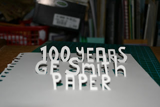
So.. my first idea is to cut the letters out of the paper, but not fully, so they can be folded up slightly, like above, so that they stand up out of the paper. I tried this firstly with just the word paper to see what it was like.. I can see that the idea is good but I need to try and make it a lot neater. I think this idea was also inspired by Peter Callesen, as it's the idea of it rising out of the paper again.
I also tried photographing it this way, to show the letters actually cut out of the paper. Although I think this looks quite rubbish really.. I decided to go for it and take a bit more care this time..
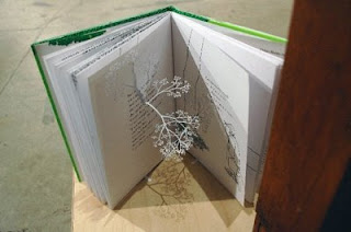
This also makes me think of Peter Callesen's work, two pieces in particular..
This is basically the method I am using here, only I'm using text, whereas in these images Callesen has obviously done a ballerina and some butterflies. I really like how they are still attached to the sheet of paper in one bit.. helping it to stand up properly, just like how I want my text.
This one is a lot neater I think, I really do like this technique! I started with just '100 years', but decided to carry on and add more text, to see what it would like like if I was to try and do the hole poster like this. Of course I would have to photograph against a plain back ground.
I think I could capture this really well in a photograph. especially now I have a BEAUTIFUL NIKON D3100 to take my photographs with. I would also like to play around with the focus a bit more, as I like how the text that is behind goes sliiightly blurry and out of focus.
I decided to try and bend the paper a bit, to see if it made the text stand out any more, and I think it did. Gives it all a bit more of an angle...
I really like the outcome of this experiment, but before I make any decisions I will have to investigate some more options and different ideas, as there is so much I could do..
Other things I could try are cutting the letters completely out of the paper and putting a darker background behind it to make it stand out.. like so:
OR I could even use the letter cut outs too..
Nothing is waste. I could even do a combination of letters cut out and the letter cut outs to vary up things. Only if it looked good of course.. another thing to try out.
This makes me want to try layering up cut outs of the letters, to create texture, maybe if photographed right that could look awesome, if you can tell that the letters are raised up out of the paper, like Braille.


