So now the photographs have been taken, it's time to get on Photoshop and start editing!
Firstly I thought I would just quickly try out some of the other layout designs that I had drawn out in my sketchbook ..

So I Photoshop just to see what they would like:

Obviously if I was to use this, I would edit the photograph to make it look a lot better, as you can see the lighting is not quite right, and also an edge is visible. However I do quite like how the image goes all the way to both side edges, this could work nicely if the photo was better? Although, the main text isn't very clear really...


I am also considering using a combination of the photographed cut out type, and digital type put on using Photoshop. My first feelings about this design is that its too simple, not in a good way. Also I think it looks like the front page of a crappy leaflet that you find in waiting rooms or something. I do not like this one at all. I think I'm not keen on the mixture of my type and the digital, I think I need to stick to my paper text only.
Still doing research...

I came across this poster on Richard Sweeney's blog, and I thought, what a great example of how a paper sculpture can be used to create a poster. The designer of this poster has chosen to use the logo of the studios in the bottom corner of this poster. Also it looks like the designer has used a grid to arrange the digital type, putting it all in the bottom third maybe? Although this poster is very simply done, I'm sure the designer did everything with a plan in mind.

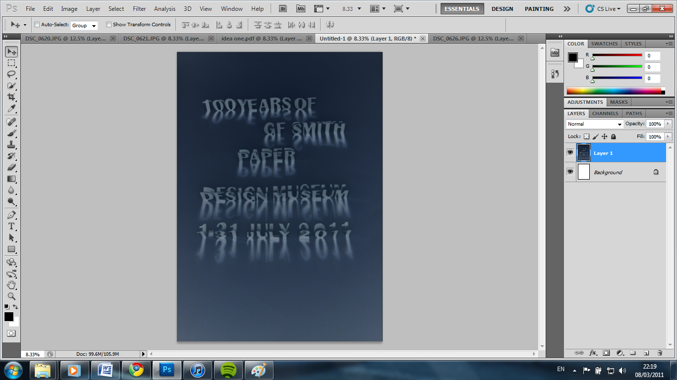
I chose to try out this one first, as I think the text looks really good in this photo. It's quite bold and defined, especially the '100 years of GF Smith..' bit, which I think is quite important.

First thing I did was change the brightness, up to 66, as I want to get the image looking more white, like the paper actually is...

Then I tried playing with the levels.. Which I ended up changing both input and output levels, which also gets it looking a lot more white. Output level is now 60, and the input level is 1.44. I think it looks so much better already!

I did also try out changing the curves, to output 62 and input 54. This didn't really change that much that noticeably, but it did make it slightly more lighter and whiter as well.
I accidently clicked on invert at one point, and this is what it looked like! Very blue, and a little bit spooky! I would never use this for my poster, but I still think it looks pretty cool!
I have made the decision that I want to put the logo of the design museum, instead of the GF Smith logo, in the bottom corner on my poster...
So I just downloaded the logo from google images...

...and opened it in Photoshop... Using the magic eraser I deleted the white back ground of the image so I was left with just the letters. After then copying it onto my poster design I thought the black looked far too dark and didn't quite fit in with the style of the image. So I turned it white instead! And it looks a lot better:

This is DESIGN NUMBER ONE completed. I am happy with this one as I think the type is nice and legible, also the layout makes a good composition.
No comments:
Post a Comment